λ-Gamut: A new advanced colorspace
Color at the forefront
Color is undeniably a big part of what makes fidelity of a photo allowing for great creative depth when editing your work. It was always a challenge to represent a wide range of colors with three RGB colorants and every colorspace has its own way of rationalizing and balancing gains and trade-offs. There is no shortage of wide gamut color spaces most of them were established decades ago when technological landscape was quite different from today. λ-Gamut (read “lambda gamut”) aims to strike the right balance between modern camera sensors and display devices.
Color master record
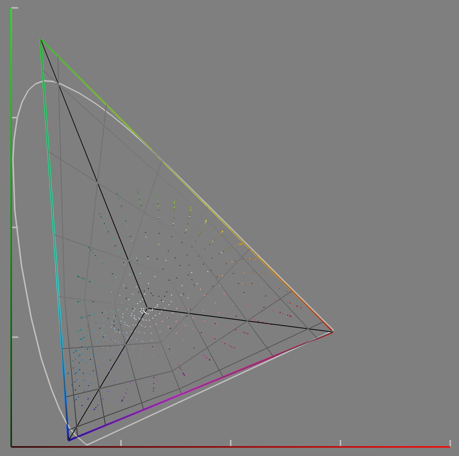
This colorspace was from the start aimed at providing ultra wide gamut so it can encompass all possible and plausible real world colors. The resulting gamut keeps this promise encompassing virtually all real world surface colors while covering the most demanding printer gamuts including high end 12-ink printers within its range as well as all colors found in majority of analog media and film materials.
Optimized for digital pipeline
Since majority of contemporary creative workflows even the ones including analog materials experience digitization step at some point it is only natural to optimize for the patterns of digital capture and display devices. Therefore this colorspace has a spectral footprint that aims to capture emission and sensitivity bands native for digital displays and cameras. It is surprising how many ultra wide color spaces fail to meet this spectral compatibility condition.
Display compliant by design
Great care was taken not to miss crucial spectral bands of modern display panel primary colorants. It is compatible with all existing wide gamut displays and ones coming in foreseeable future as well. The primary emission ranges were matched with common display standards and technologies. The gamut was chosen so the identified dominant display primary wavelengths are covered. The blue and green primaries were kept virtual out of necessity to meet this strict physical constraint without introducing bottlenecks to the range of colors to be displayed due to insufficient gamut coverage.
Comparisons with existing color spaces
The natural comparisons that come to mind are without a doubt spaces like ProPhoto RGB, Rec. 2020 or ACES gamuts. Briefly speaking the resulting colorspace was aimed at preserving major industry standards where possible if there was no adverse effect to the previously mentioned objectives and to keep existing display spaces covered. In the end only single notable divergence was made between one of the popular color spaces. But let’s look at some visualizations first as they explain this much better.
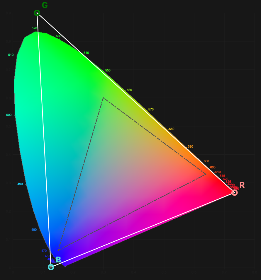
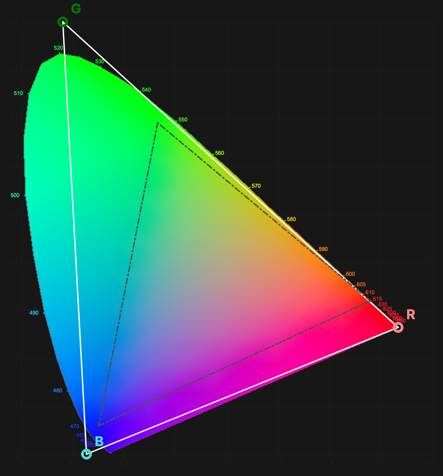
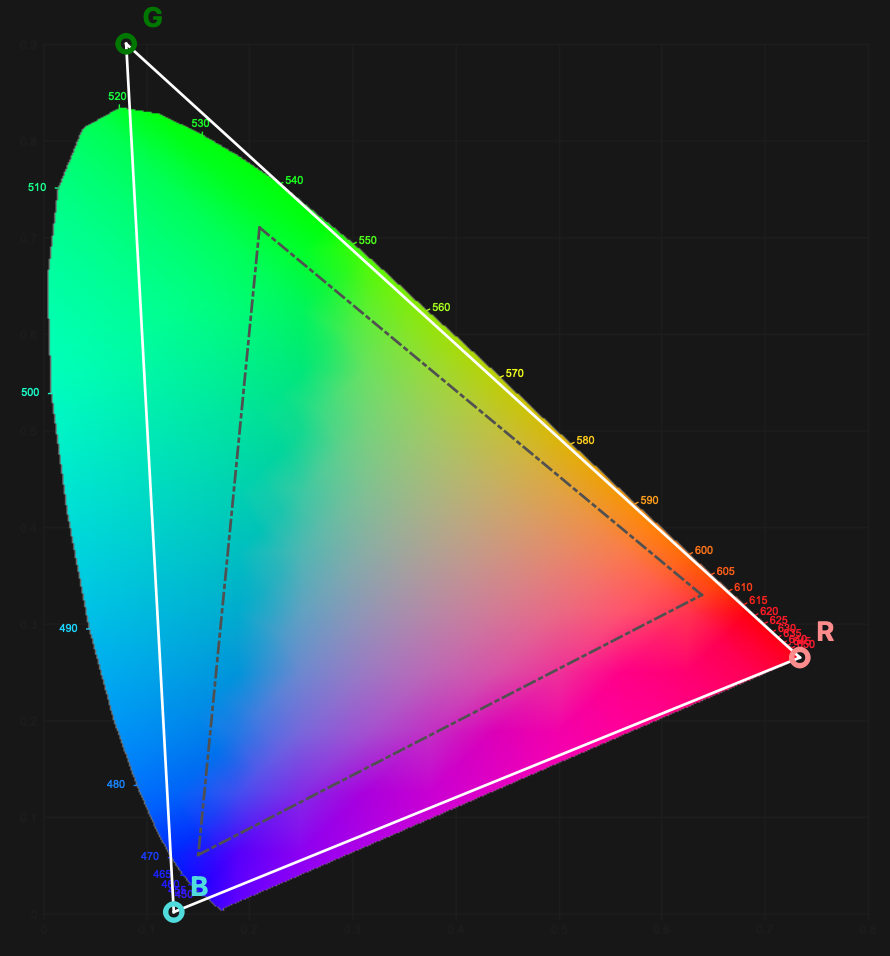
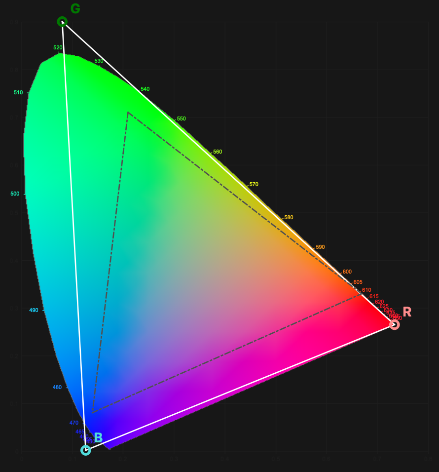
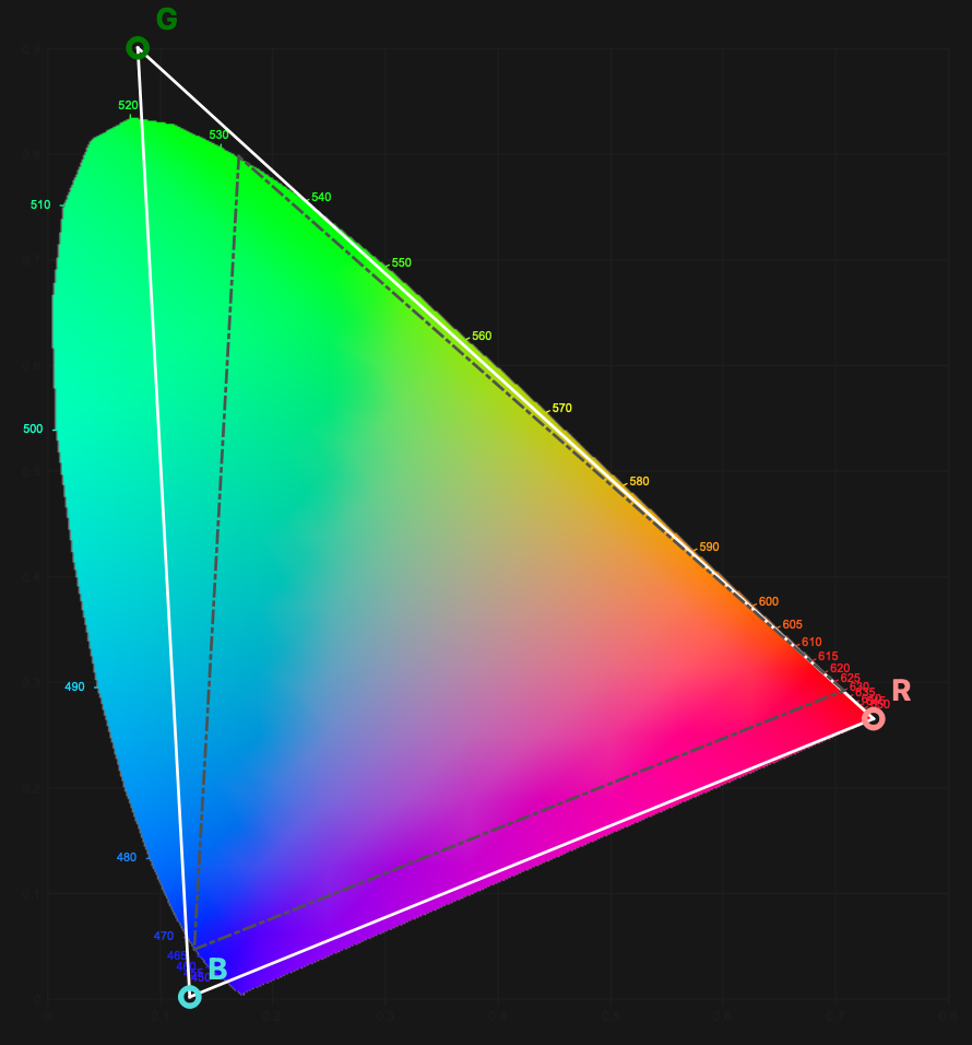
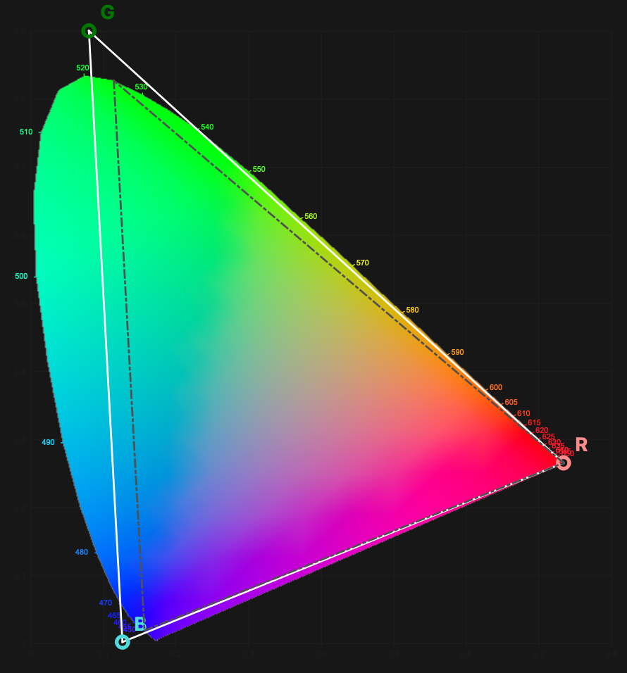
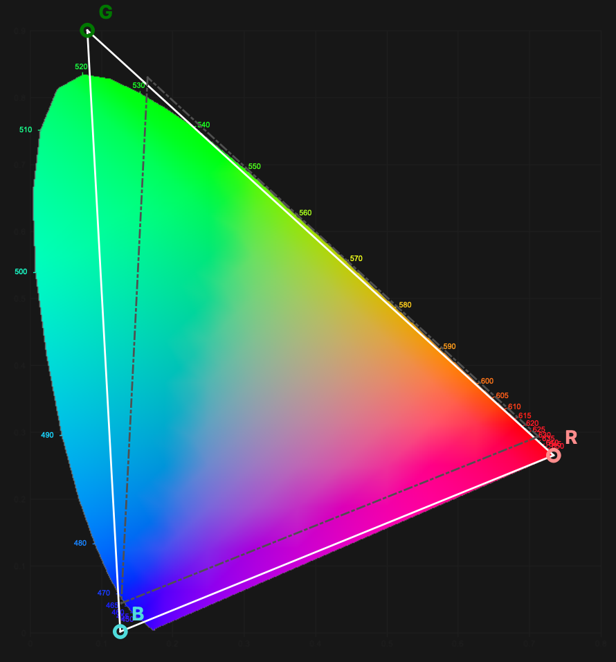
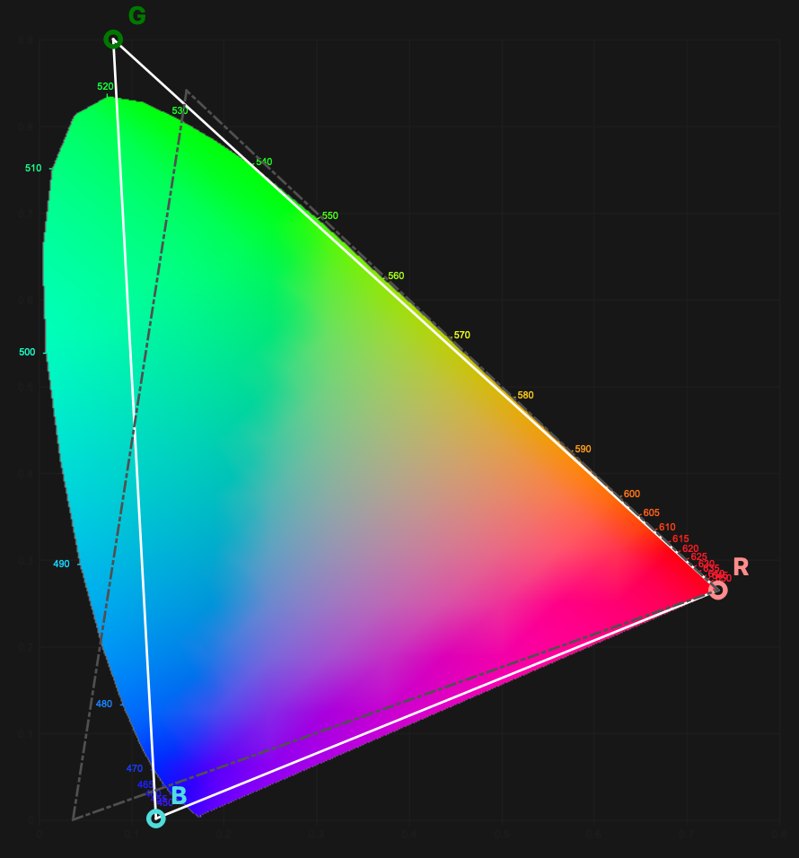
As it is apparent from the above graphics the λ-Gamut only diverges significantly from ProPhoto RGB. The reason ProPhoto RGB was rejected as compliant candidate to the coverage goals mentioned before is because it sacrifices too much in the blue-indigo spectral band extension and that is where lot of actual signal information from displays and cameras reside in the blue region. In turn this also ensures more richer purple, magenta and deep blue tones for λ-Gamut compared to ProPhoto RGB and less wasted bit depth on virtual colors as well. Again there is argument to be made for blue-cyan region in case of ProPhoto RGB but there are no printers to print them nor displays to display them in terms of state of the art as of today. Instead λ-Gamut achieves much better hue extension in the green-cyan region where the printers and displays actually see much greater advantage. At end the resulting color volume coverage in terms of number of colors is very much similar between the two color spaces considering ProPhoto RGB has a bit more imaginary colors in its volume.
Who is this colorspace for?
This colorspace is aimed at people working with all sorts of photographic processes and materials both analog and digital. It has some advantages as was shown compared to ProPhoto RGB the de facto current standard for such types of media applications. ProPhoto RGB is the more common choice and a great color space for real world surface colors preservation as it was designed to do however the display or digital camera technology was not taken into extensive consideration as I pointed out before. Ultimately the choice is yours and it is always better to have choices.
New colorimetric baseline
All further colorimetry measurements and resulting products from SPEKTRAMATIK project will be referenced against this colorspace. You are invited to explore it for yourself. This project will also aim to develop software for more easy application of this color profile inside your workflow in the future.
Compatible software
For current usage it is recommended to preprocess images in Affinity for example using batch processing functionality of the affinity suite for raws and then edit them in your editing software of choice. Below is table indicating editing software and compatibility with custom ultra wide spaces. It is recommended to use software with at least partial compatibility for editing in the λ-Gamut.
| Editing Applications | Compatibility |
| Lightroom | No (not recommended) |
| Adobe Camera Raw | No (not recommended) |
| Adobe Photoshop | Partial (recommended for already processed and profiled raws) |
| Capture One | Unknown (not recommended) |
| Affinity | Full (recommended for raw processing and editing) |
| Affinity Photo | Full (recommended for raw processing and editing) |
| CameraBag Pro | Partial (recommended for already processed and profiled raws) |